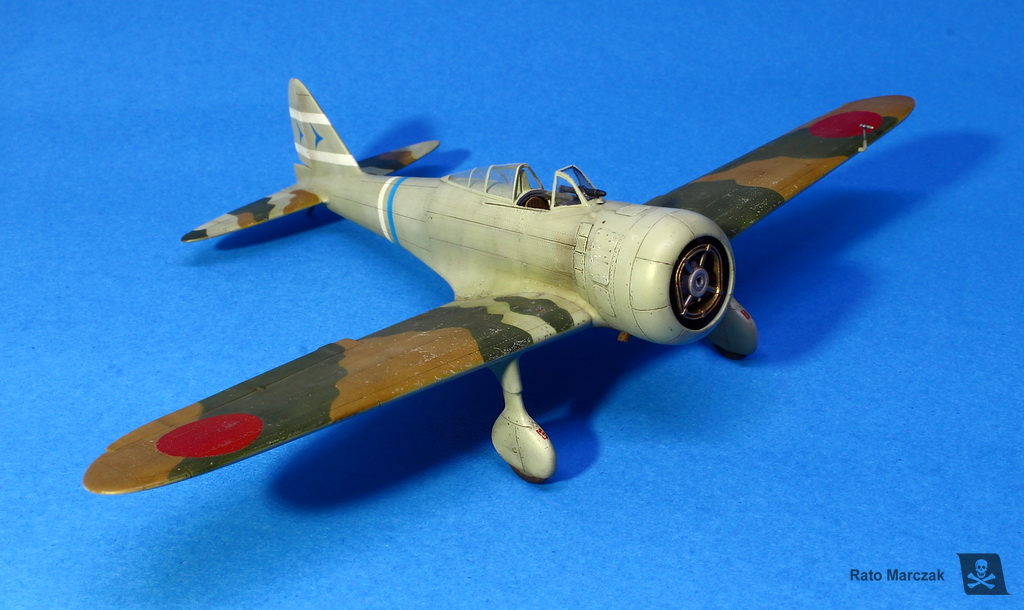
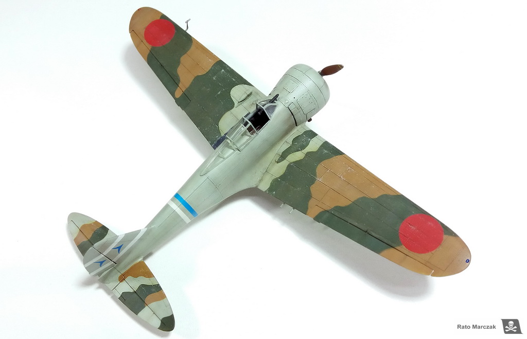
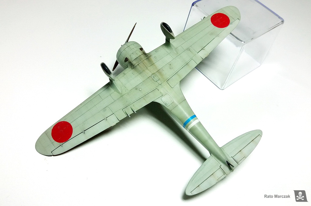
| ICM Nakajima Ki-27 (Type 97 fighter) Otsu in 1/72 scale |
| Finished: November/2020 |
At
the very beginning of WWII, the nimble Nakajima Ki-27 (allied codename
Nate) was to the Imperial Japanese Army as important as the Mitsubishi
A5M Claude was to the Imperial Japanese Navy. They were the
predecessors of fighters that would become famous in the next war
years. The Nate was one of the fighters that faced the Russian fighters
flown by the Chinese before the war, and later the famous American
Volunteer Group. A summary of the Ki-27 history can be found here.
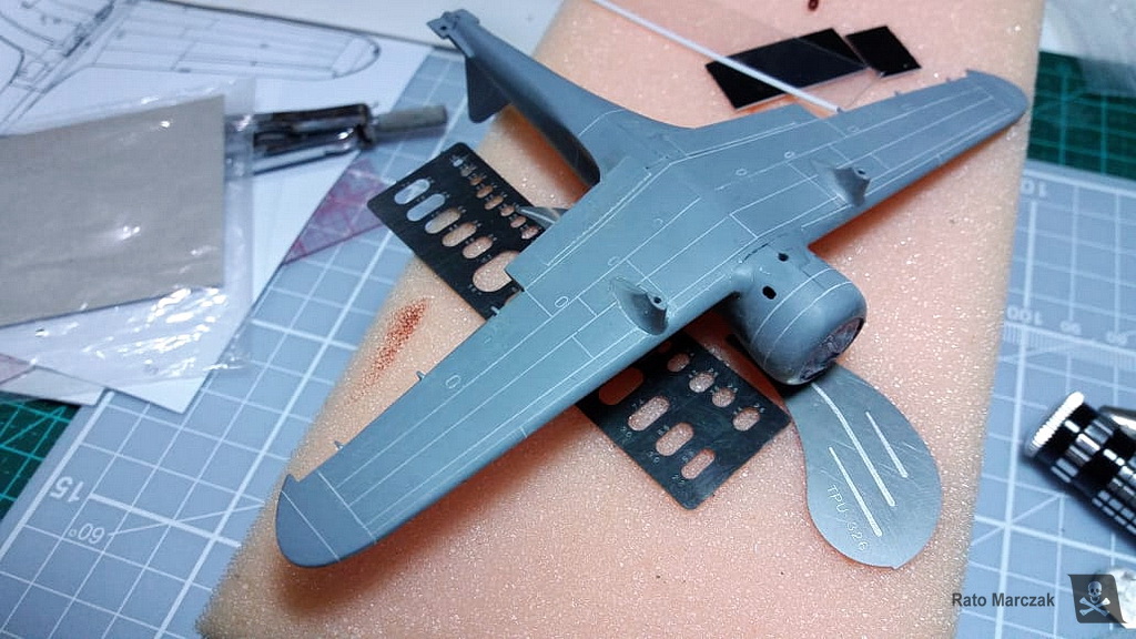
I have been thinking of adding a Nate to my 1/72 scale for a while. One day, checking on my kit stash, I found the ICM Ki-27 and the RS Ki-79 (the two-place version of the Nate). I decided on the first one because it had an unbelievably good rendering of surface details. More on that later. My sample was a Ki-27 Ko, but I would finish it as an Otsu:
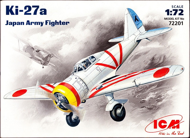
After checking some books, I started decorating the cockpit sidewalls and floor. I used Reheat and left-over PE parts that resembled the real cockpit, plus plastic bits:
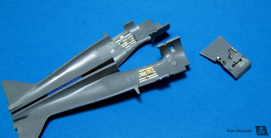
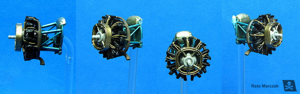
In order to close the fuselage, I had before to assemble and finish the firewall, engine mount, and engine itself. I added a data plate and plug wires to the engine and replaced a couple of rods of its tubular mount for thinner ones. Later I realized that only the front part of the engine would be visible. Therefore, if you are assembling this kit, do not waste time painting everything behind the engine. One more thing: the beautifully molded exhaust manifolds were drilled and installed as per instructions. Don't do it! I found out that it is impossible to install the cowling over the engine with the manifolds installed. Instead, remove the end of the exhausts, and glued them through their cowling openings from the outside after the model is painted. Worked for me.
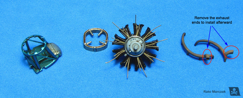
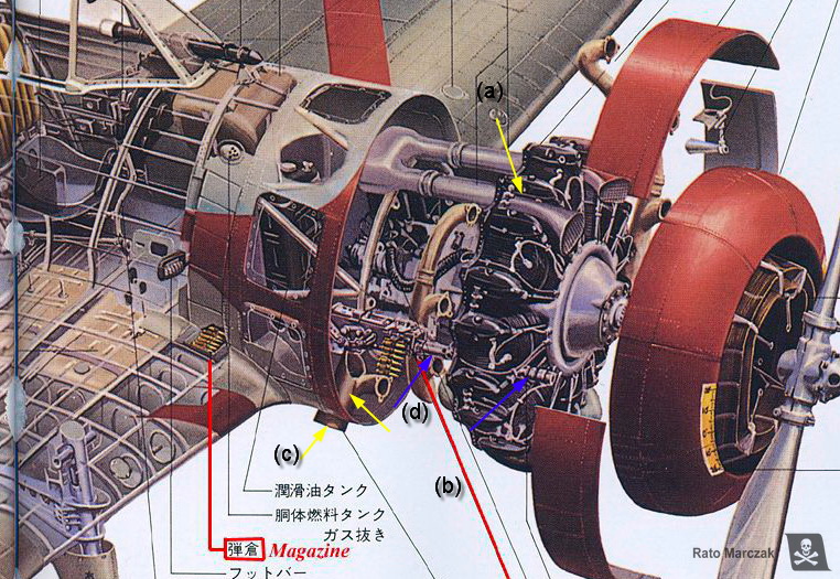
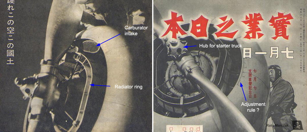
The illustration below (from Maru Mechanic book) show (a) the carburetor air intake - it comes with the kit and fit nicely; (b) the aforementioned exhaust collector ring - must be discarded; (c) the only visible part of the exhaust; and (d) the machine gun muzzles - better to discard them for easy fitting of the engine.
This particular model belongs to what I call 2nd generation of ICM models. These models (along with the I-16, the Tu-2, the I-1, among others) are interesting because they bring recessed panel lines, beautifully molded overlapping panels, fasteners, and hatches with a finesse that only larger-scale models generally have. But they also bring two problems: they are molded in very soft plastic, and the fit is not the best. I can live with the plastic, but the bad fit brings a terrible consequence: it is impossible to build these models without sanding a good part of those wonderful surface details.
As a former IPMS judge, I could not live with intermittent surface details. It is a matter of consistency: a panel line cannot disappear where it was sanded and reappear elsewhere! After assembling the model I realized that I had removed much of the surface details. They resisted in some places, but at this point, it was clear that I would not escape from rescribing the model. Therefore I decided to sand more and leave the model completely flush. Yep, I had just removed the major single reason for choosing this model to build.
Scribing: the second most boring job in plastic modeling. Using the drawings from vol.2 of Design with Precision books, I scribed the hole model. The photos below show the main panel lines already scribed, before the clean-up:

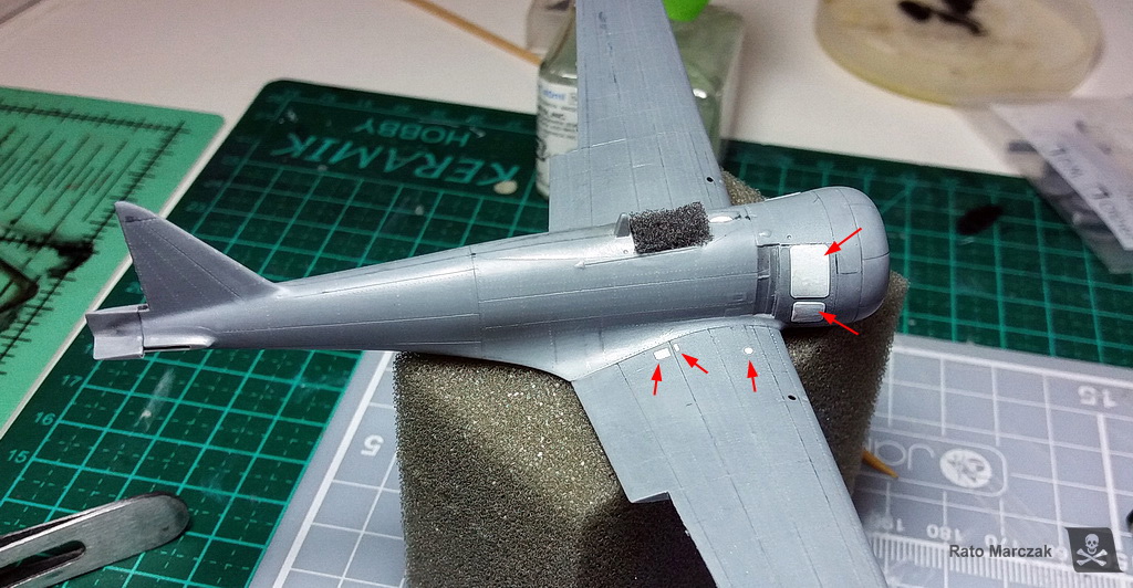
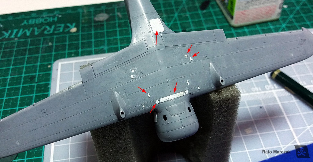
Riveting: the most boring job in plastic modeling. I have been trying to avoid thinking in rivets, after all this is 1/72 scale, right? But I just can't. I honestly think that correctly applied rivets give another degree of realism to scale models, and I have been riveting my models since the late 1990s, so I am very comfortable in claiming that it is something really boring. And another thing: to tackle a riveting session means having a good, reliable set of 3-view drawings. Don't put rivets where you don't know - it is the same as creating fake structural elements. My advice to countersunk rivets is always: sand them down. Look at the photos! Rivets should not be easily visible everywhere. If you have to put your model at a certain angle to see the rivets, you probably did it right. Nothing can be worse than a panel with lines of rivets looking like the armored gate of a medieval castle... And since I also removed most of the overlapping (raised) panels, I replaced them with 0.15 mm plastic bits. Alternating raised and recessed details adds more 'three-dimensionality' to the model, so to speak:
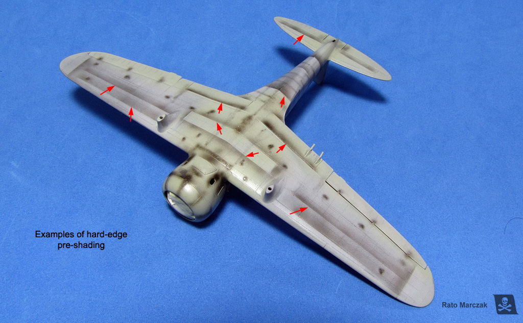
Next, pre-shading. I know, I know... I already can imagine you guys thinking that this is a waste of time, that it is not controllable, that you cannot see it after painting, and blah blah. I respectfully disagree. I think that the problem with non-effective pre-shading usually is in its execution. When properly done, particularly in subjects painted with lighter colors, pre-shading does deliver a very subtle effect. Evidently, some modelers do magic with the airbrush and can obtain the same result with post-shading, but then, you want to reduce the risk of applying this effect after that beautiful camouflage is done and the model virtually finished. And if necessary, you still can use pos-shading.
Well, the pre-shading 101 states that the technique helps to bring some variation on the color saturation, emulate fake shadows, and replicate dirtied areas. But I learned over the years that in certain places it can be more effective for all that if one of the sides of the pre-shading has a hard edge. This not only will help to distinguish features like flaps, selected panels, and main aircraft subassemblies but also diminishes the diffusion of the pre-shaded areas, making them more visible (I will be beaten by my friends if I use the word 'highlight' here...).
So, besides a fine-tipped airbrush, I like to pre-shade my models with a piece of post-it in hand to make a few hard-edged shadows on the fly:
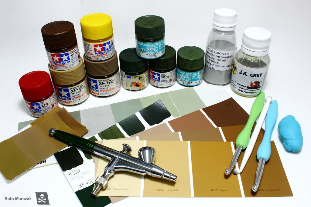
Camouflage, finally! The first color is evidently the IJA A5 grey. Even though by then I had not yet chosen which specific aircraft I'd be doing, the IJA grey is the factory finish color, so it went first. Illustrator Rikyu Watanabe described the A5 color of the Ki-27 as "mei-hairyoku-shoku (IJA gray-green) - a glossy gray that has a very slight green tint". I used polyester paint from Tom Colors brand (more on its accuracy below). Polyester paints are very tough, and the risks of being scratched during handling are minimal. And besides, they airbrush beautifully, even better than any Gunze/GSI lacquers that I have used. These paints also have a high solid content, so it is important to thin them to avoid suppressing the effects of the pre-shading:
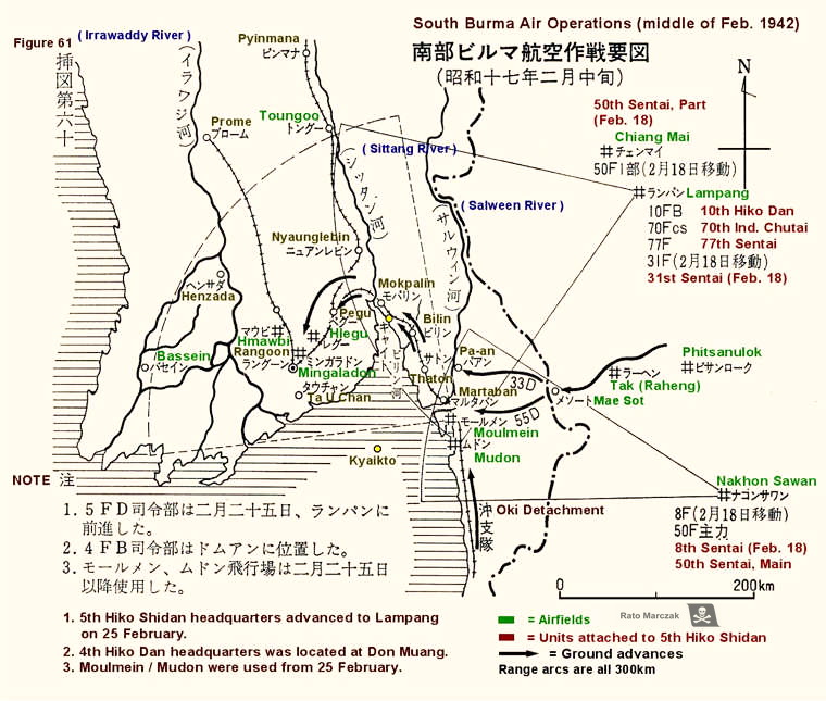
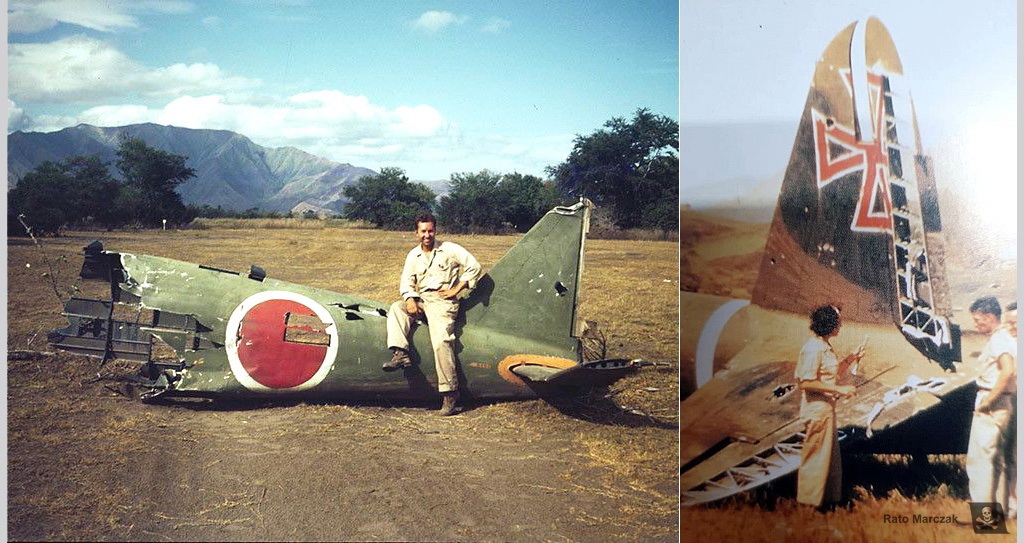
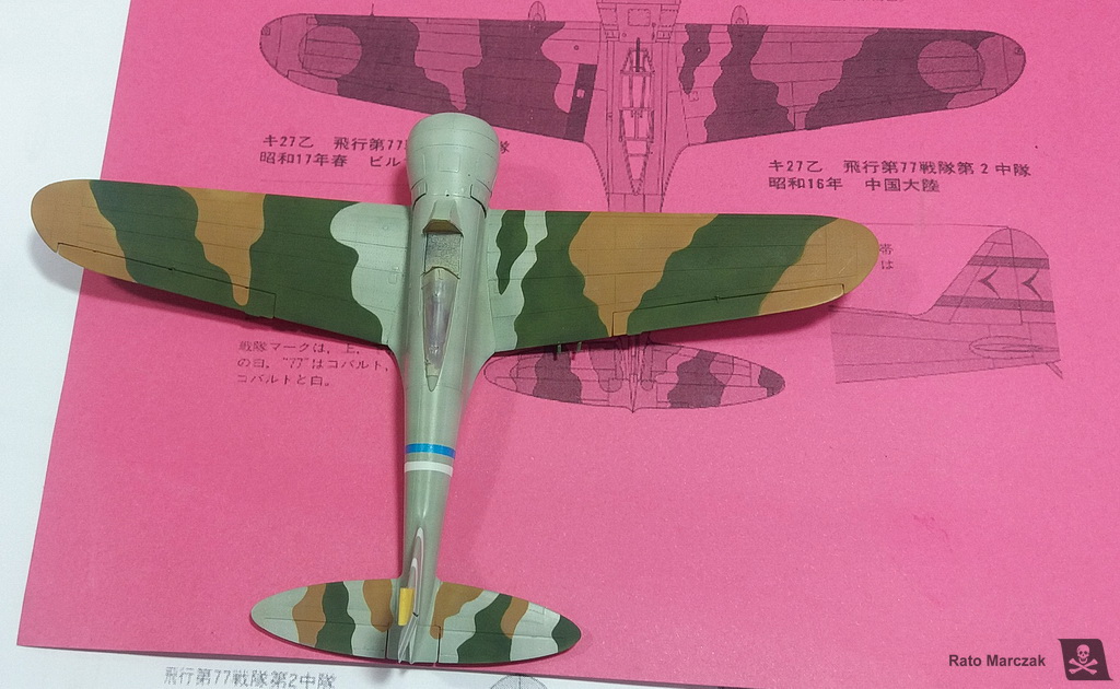
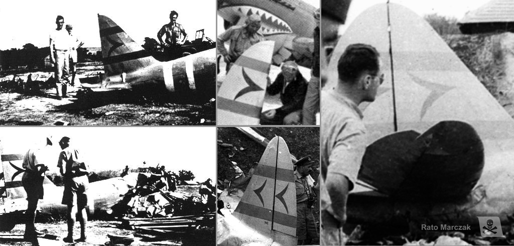
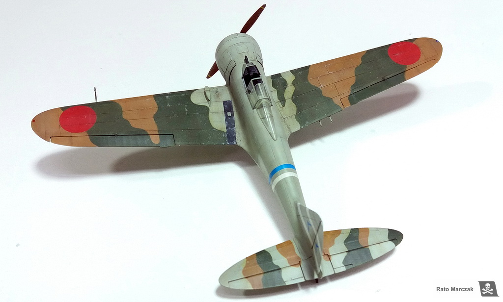
My next task was to decide on the camouflage scheme. I never liked much the Nates in overall IJA grey scheme - too boring. It is well known that the Ki-27s of 77th Sentai had wings and tailplanes expediently camouflaged in two colors during the invasion of Burma. This is a very interesting and unusual scheme but unfortunately, there is not much information about the colors used or period photos. One scheme that called my attention (and that I have already seen depicted in models previously) is the probable machine of the leader of the 1st Chutai, Capt. Toyoki Eto. He led the 1st Chutai from March 1940 until May 1943, and this particular scheme suggests that the camouflage was hastily applied in two colors. Some Japanese references mention a magazine from 1969 which I failed to find. However, vol.29 of the Burindo book series Famous Airplanes of the World, as well as one the Ian Baker's Colouring Books bring illustrations of this particular scheme and I was able to assign place and date to the Eto's plane.
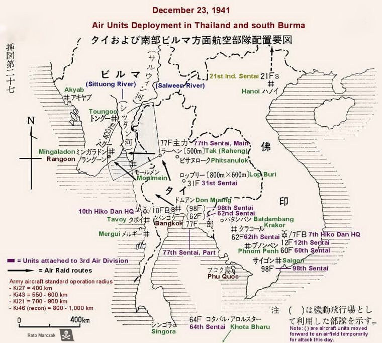
The 77th Sentai used the Ki-27 from October 1939 until August 1943. It was based in Northern China in 1937-38, then moved on to central China, Manchuria, Cambodia and in December 1941 it moved to Thailand. First Daum Muang then Raheng, and finally Lampang, where the group stayed and fought important battles.
From what I was able to conclude from my research, this scheme most probably represents Eto's aircraft during February 1942, when based in Lampang. Later they would move again, this time to invade Burma in March 1942, where they served until going to Manchuria in mid-1943.
The next problem was to discover which two colors were used in this scheme over the grey. The IJA A5 grey is not questionable, as this is factory-applied. I had to decide about the green and brown used. It is not a trivial point, as these planes were painted in improvised fields. I collected a number of color photos from that period, and along with the information I had from the cited books, plus the decal instructions from Lifelike (which is a Japanese decal manufacturer), I felt confident enough that the colors used were typical of the IJA planes, or very close. I mention this because some modelers raised the possibility of this plane being painted in two greens... oh boy, more doubts.
Thorpe, Jones, and Oishi's book IJA camouflage and markings, from 1968, remain one of the most comprehensive and trustworthy references on the subject. They suggest that this scheme was a variation of the C3 or C5 schemes, and therefore would use the A1 or A3 green together with the A12 brown. This makes a lot of sense, as Perrys, Anns and other IJA aircraft were using these colors as well during that timeframe. Robert Mikesh, during his time at NASM produced a table of Munsell equivalents for Thorpe's IJA colors which helps to validate paint mixes and digital art. One nice Japanese color research conducted by K. Owaki (in Japanese) provided counter-proofs to my scans from Thorpe's book. I had two scans with different color saturations, and probably the second one (scan 2) is more reliable.
In a document dated 2005, William Leyh & Nick Millman produced a Thorpe-Munsell to RGB and FS 595b cross-reference table, and they show clearly that Thorpe's A1, A3, and A12 color chips all produced DE2000 indexes above 2.0. However, the FS colors proposed by Ian Baker are different, and they are FS 24424 for grey, FS 24095 or 24102 for green, and FS 20118 for brown. I personally think Baker's FS suggestions for the greens and blow are closer to what I saw in the photos (I compared them using Federal Standard 595 Color Server - figure below). Finally, Aviation of Japan website brings a nice article comparing hobby colors for the Ki-27, and I found them particularly useful to verify my grey color, which was spot on with their 1927 sample. Examining my Tamiya XF-14 bottle, I found out that it is much closer to the correct color than suggested by the article, although it lacks the green tint, which is not necessarily wrong, as it is known that the factory-applied Army Hairyokushoku (ash color) oxidized heavily, making it look lighter and concealing the blue/green tint. GSI 128 Grey Green is pretty much the same. Conclusion: both Tamiya XF-14 and GSI 128 can be used to represent well-used aircraft.
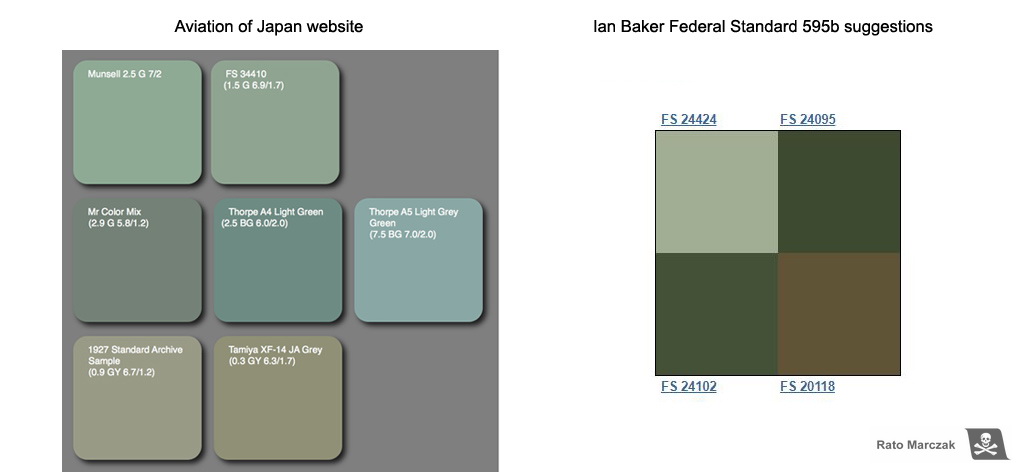
Since I was very satisfied with the accuracy of my IJA grey, I decided to play digitally with my green/brown options before deciding anything. Using digital samples of the table below, I could compare visually which combination would look better. At this point, I was convinced that both FS suggestions for the green from Baker's book were reasonably close to Army Dark Green A1, but I needed something more yellowish than FS 20118 to be closer to Thorpe's A12 color chip.
The figure below brings the art from Burindo's FAOW book on the far left. The other shemes follow the table above.
I would love to put my hands in one of those facsimile reproductions of the JAAF paint standards published by Gakken in Japan some years ago. Since I don't have it, I settled somewhere between schemes 2 and 7 above, which means to prepare the A1 green close to Midoro Iro and the brown following Thorpe's A12. Looking at the few color photos that I could find, I guess my choice was in a good ballpark...
For the brown, I mixed Tamiya's XF-59, XF-52, XF-79, and XF-3. I don't know the ratios. I started with an equal mix of the last two and added the others as needed to match A12. My mix for the A1 green started with Tamiya's XF-58 (I found XF-13 too dark for 1/72 scale) and added a bit of XF-3 and GSI H-405 for highlights. Sorry for not taking notes of the exact mix, but I really did this on the fly.
 .
.
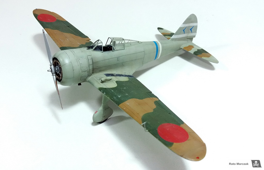
Before painting the camouflage, I masked and painted the 1st Chutai white stripes on the vertical stabilizer and the fuselage, followed by the fuselage blue stripe indicating that this was the aircraft of the Chutaichō. The drawings in FAOW book were printed in scale and used as a guide to airbrush both colors. Blu-Tack provided raised masks, and a crochet hook is my favorite tool to make the putty to follow the correct contour. I did not waste time with highlights at this point:
Evidently, the colors were too uniform at this stage, and a tad too dark for the scale. It is difficult to work with airbrushed effects with putty masks and avoid paint oversprays where you don't want them... But I was happy that the pattern followed more or less well the drawings which, by its turn, supposedly followed the lost Japanese publication containing the ghost photo of this aircraft... I guess.
Ok, moving on. All ICM decals in kits of this harvest are simply unusable. The brand has been producing some of the best models on the market lately, decals included, but having built a few of their models from that vintage, I would advise you not even to try to use these old ones. Fortunately, the markings on this particular aircraft are relatively easy to mask and paint.
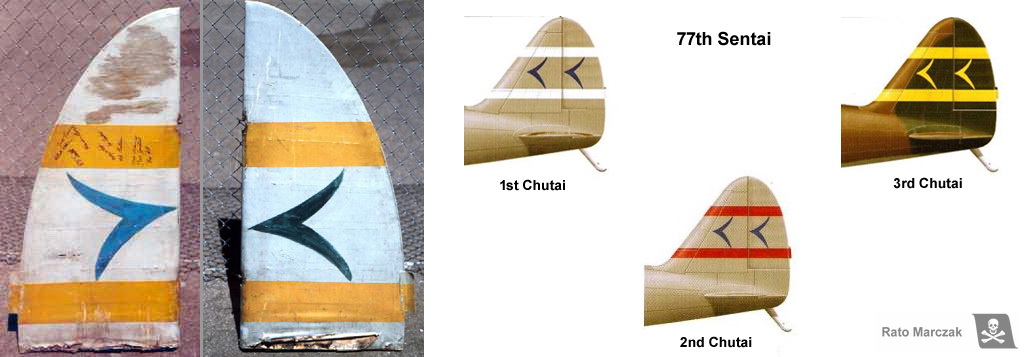
The vertical stabilizer had a stylized 77 on both sides. Having the white stripes already in place, it was just a matter of cutting out the symbols from masking tape and airbrushing them with the same blue used on the fuselage. There are many photos showing the shape of these symbols.
Here is the result. Realistically imperfect:
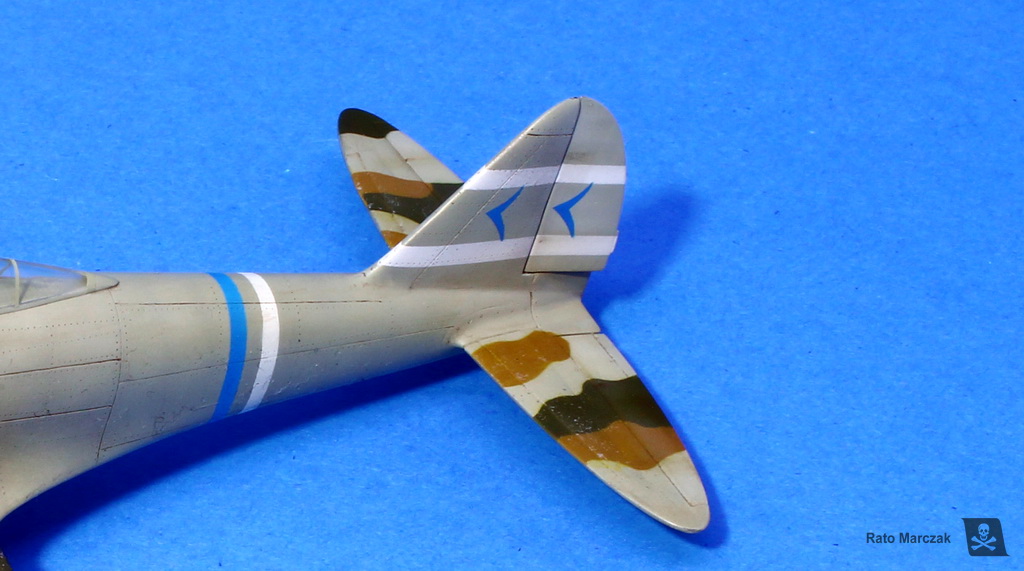
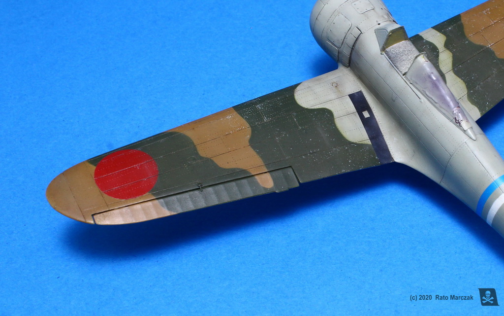
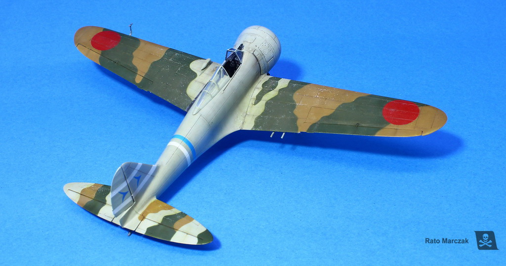
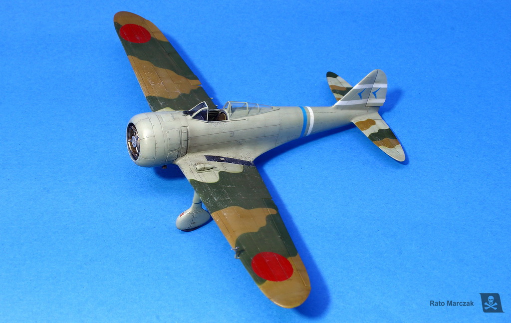
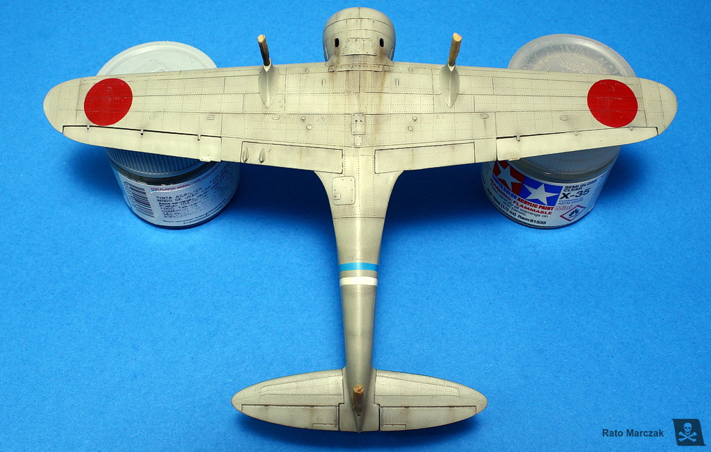
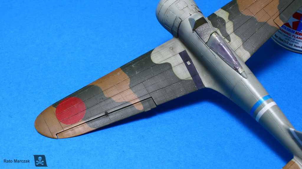
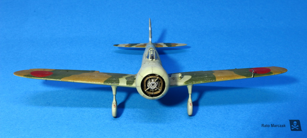
The 900 mm Hinomarus were all painted, as well as the black anti-slip stripe on the port side of the wing root.
The next steps took many nights and encompassed the superposition of various effects to produce simulate weathering. I will summarize them here but keep in mind that this is my method, and the same effect can be obtained with different methods and different products. More importantly, I don't enjoy using a product/technique without knowing why, neither I am convinced that a modeler should apply a given technique simply because 'it is fun'. So, here are the sequential steps I employed on this model and what I was trying to emulate with each one:
And that is pretty much it. I also weathered the Hinomarus, only lightly, as they were generally well cared for, particularly at the beginning of the war. The anti-slip stripe and the exhaust streaks would be treated separately. The photos below show in detail the effects obtained with these simple techniques:
The next photos show the overall effect of the weathering on the model so far.
For the modeler, it can be difficult to have a clear idea of how far the weathering is going during the process. Of course, it is always a nice idea to step back for a few hours and check again your work with a fresh mind, but by then the original painting is already changed, so it is difficult to compare the effectiveness of the whole process.
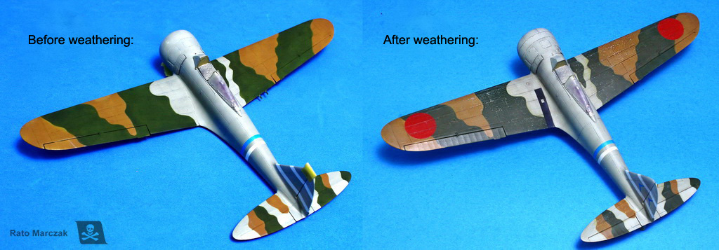
I like to take a photo before starting the weathering. It helps me to keep track of many things, but also gives me a clear indication of potential problems like color shifting. I know many cases of overweathered models because the modeler lost his/her reference. Even worse, sometimes the repeated application of effects can ruin an otherwise good color choice at the start. In many cases, this explains why we find so many magnificently weathered models with color tones totally irrealistic.
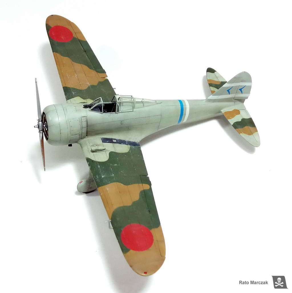
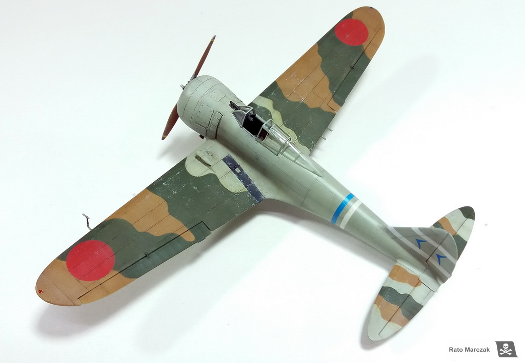
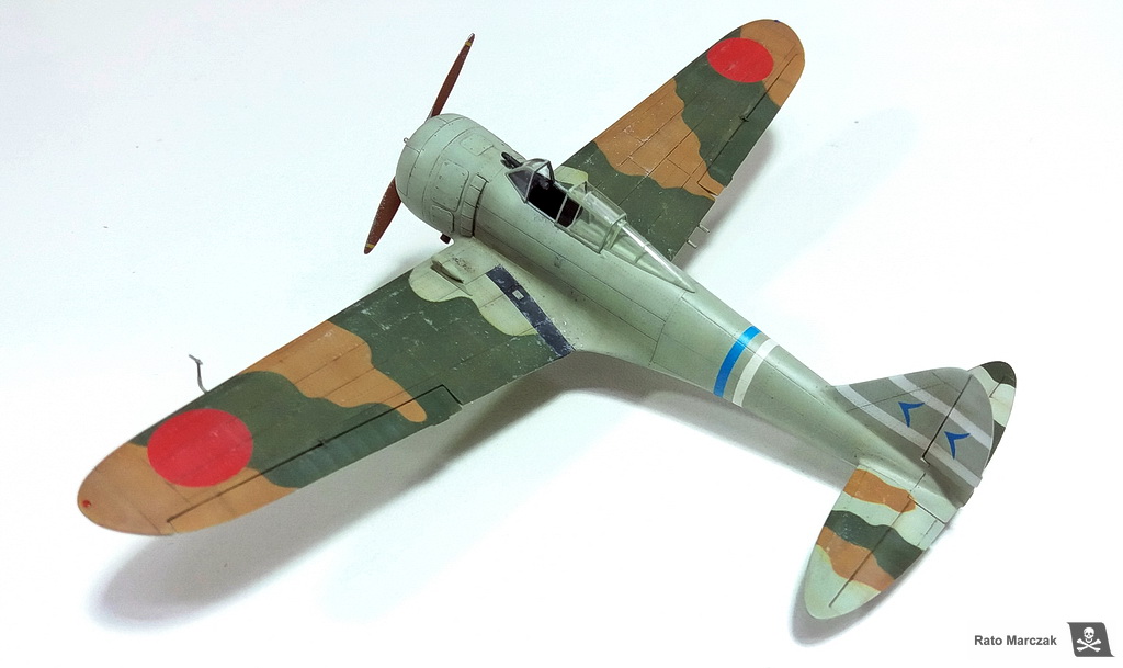
In my case here, the level of weathering I was looking for was achieved and added some realism to an initially too boring camouflage application. I was 85% satisfied with the results.
Radials leak, everybody knows it. Add up gravity and you will naturally find the underside of the engine cowling notably grimy. Simulate that without going overboard is one of the steps I enjoy the most in modeling.

My basic sequence for that is the following:
As I said, this treatment is applied to the underside of the cowling, only. The photos below show steps 2 and 3:
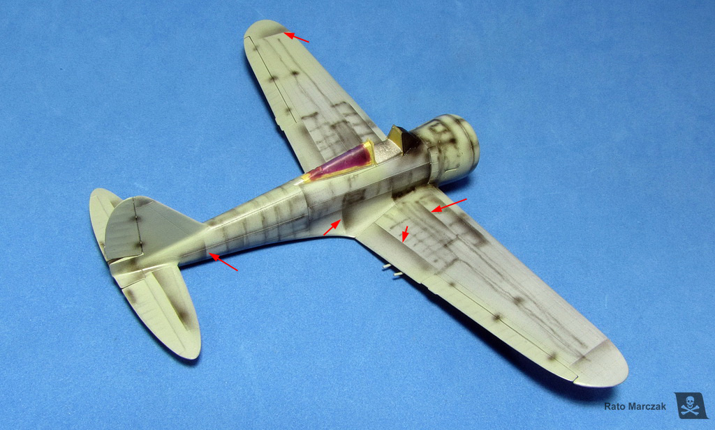
Another thing that I liked was the final aspect of the rivets. Whenever you do rivets on your models, it is very important to sand them down, or you will end up with rows of tiny lumps that will look like a knight shield from the 13th century. I mean, unless you have raised rivets, but that's another story. This photo was taken purposedly at an angle that shows the rivet lines on the upper port wing. I also retouched the photo to make them more visible. Alive, you really have to get close to the model to see the rivets:
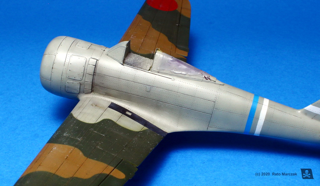
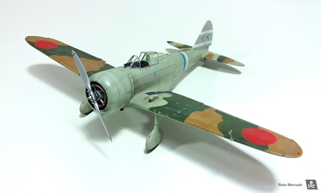
At this point, I decided to glue the landing gear legs. After test fitting the kit assemblies to the model, something did not look right. It took me a while to figure out what. When I checked the landing gear against drawings, it became clear: ICM missed awfully the shape of the spats. Fortunately, I had RS models landing gear from their Ki-79 kit laying around. I trashed the ICM landing gear. The correct shape of key parts makes all the difference. Check it for yourself:
The spats were painted, weathered, and installed. I had to hand paint the small red stencils (no step) in front of each spats since the kit decals were trashed. The anti-slip stripe on the port wing root was weathered with the same treatment that I applied to a similar item on my Revell Hurricane Mk.II C.
For the final clear coat, I played with semi-gloss and flat. Actually, the flat clear was used on a few areas only, like wing roots and underside of the fuselage. Most of the model was coated with a satin finish, and I even let it with the original sheen in some places. These variations in the sheen also add interest to the model and translate correctly what we find in period photos.
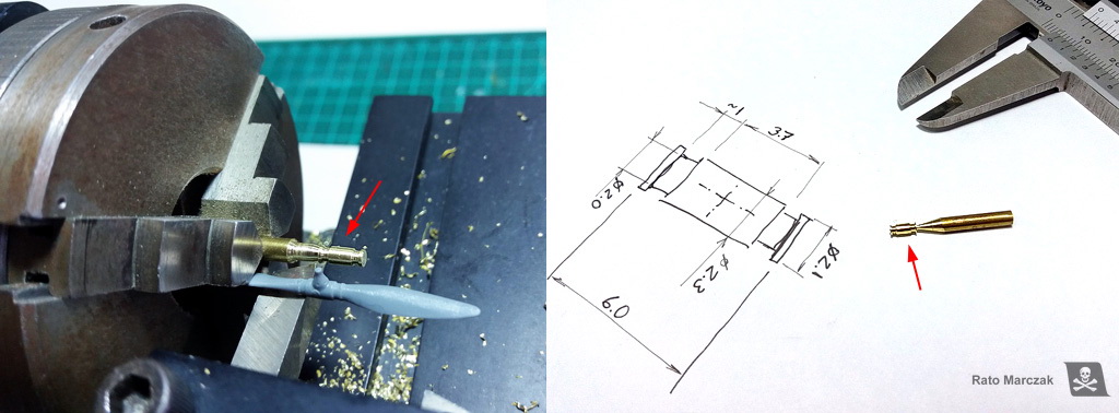
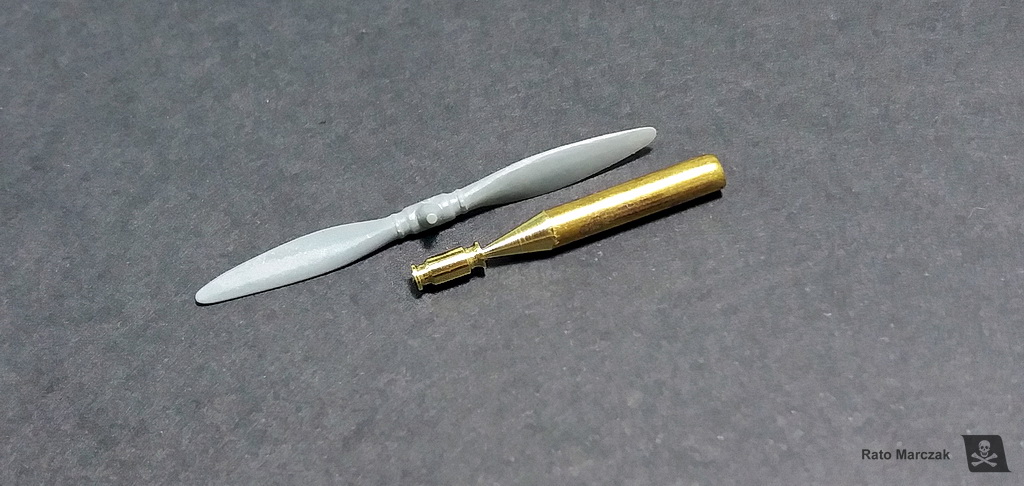
Up to this point, I have been postponing the installation of the propeller. And for a reason: the hub details in the ICM part were very soft, and it was almost impossible to clean it up neatly. I made some measurements and decided it would be easy to turn a new hub on my lathe. It went ok. I did not include all de propeller hub details at this point because I made a resin copy of it. Working with the copy, I then drilled the holes to accept the blades and added clamps.
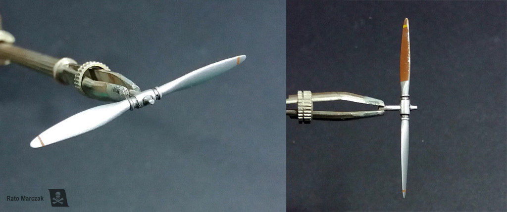
The claw clutch at the center of the hub came from the kit propeller and is devoid of any detail. This part is actually very complicated as it is connected to the drive end of the starter truck. I found a couple of period Japanese magazine covers showing the clutch in detail, but because this model will be in a diorama along with the Hasegawa Toyota starter truck in position, I did not mind much.
If you look around the engine cowling of the Ki-27s, you will note a rule painted on both sides. Those are indexes used to adjust the guns/propeller synchronization. I could have made them as decals, but I discovered it only during the late stages of my build when the model was already painted. They are not visible in all Ki-27s, though.
So I installed the new navigation lights (I sanded them off the wings in the beginning), tail skid, Pitot tube, gunsight, and a gun camera mounted on the wing. The ends of the exhaust stacks (see the beginning of the text) were also glued into their apertures.
And just to prove that this model is mine, I lost the sliding portion of the canopy. I had to thermoform a new one in clear styrene. Oh, boy...
I then would focus on the building of the Toyota GB starter truck and on the diorama base.
These are the books that I used as the main references during this project. I hope you like this article and it inspires you somehow for your next model.
I have been thinking of adding a Nate to my 1/72 scale for a while. One day, checking on my kit stash, I found the ICM Ki-27 and the RS Ki-79 (the two-place version of the Nate). I decided on the first one because it had an unbelievably good rendering of surface details. More on that later. My sample was a Ki-27 Ko, but I would finish it as an Otsu:
After checking some books, I started decorating the cockpit sidewalls and floor. I used Reheat and left-over PE parts that resembled the real cockpit, plus plastic bits:
In order to close the fuselage, I had before to assemble and finish the firewall, engine mount, and engine itself. I added a data plate and plug wires to the engine and replaced a couple of rods of its tubular mount for thinner ones. Later I realized that only the front part of the engine would be visible. Therefore, if you are assembling this kit, do not waste time painting everything behind the engine. One more thing: the beautifully molded exhaust manifolds were drilled and installed as per instructions. Don't do it! I found out that it is impossible to install the cowling over the engine with the manifolds installed. Instead, remove the end of the exhausts, and glued them through their cowling openings from the outside after the model is painted. Worked for me.
The illustration below (from Maru Mechanic book) show (a) the carburetor air intake - it comes with the kit and fit nicely; (b) the aforementioned exhaust collector ring - must be discarded; (c) the only visible part of the exhaust; and (d) the machine gun muzzles - better to discard them for easy fitting of the engine.
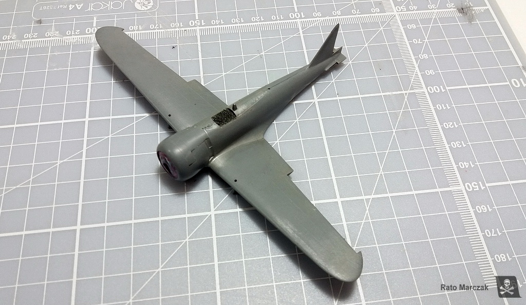
This particular model belongs to what I call 2nd generation of ICM models. These models (along with the I-16, the Tu-2, the I-1, among others) are interesting because they bring recessed panel lines, beautifully molded overlapping panels, fasteners, and hatches with a finesse that only larger-scale models generally have. But they also bring two problems: they are molded in very soft plastic, and the fit is not the best. I can live with the plastic, but the bad fit brings a terrible consequence: it is impossible to build these models without sanding a good part of those wonderful surface details.
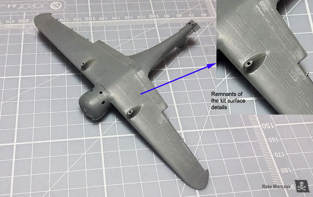
As a former IPMS judge, I could not live with intermittent surface details. It is a matter of consistency: a panel line cannot disappear where it was sanded and reappear elsewhere! After assembling the model I realized that I had removed much of the surface details. They resisted in some places, but at this point, it was clear that I would not escape from rescribing the model. Therefore I decided to sand more and leave the model completely flush. Yep, I had just removed the major single reason for choosing this model to build.
Scribing: the second most boring job in plastic modeling. Using the drawings from vol.2 of Design with Precision books, I scribed the hole model. The photos below show the main panel lines already scribed, before the clean-up:
Riveting: the most boring job in plastic modeling. I have been trying to avoid thinking in rivets, after all this is 1/72 scale, right? But I just can't. I honestly think that correctly applied rivets give another degree of realism to scale models, and I have been riveting my models since the late 1990s, so I am very comfortable in claiming that it is something really boring. And another thing: to tackle a riveting session means having a good, reliable set of 3-view drawings. Don't put rivets where you don't know - it is the same as creating fake structural elements. My advice to countersunk rivets is always: sand them down. Look at the photos! Rivets should not be easily visible everywhere. If you have to put your model at a certain angle to see the rivets, you probably did it right. Nothing can be worse than a panel with lines of rivets looking like the armored gate of a medieval castle... And since I also removed most of the overlapping (raised) panels, I replaced them with 0.15 mm plastic bits. Alternating raised and recessed details adds more 'three-dimensionality' to the model, so to speak:
Next, pre-shading. I know, I know... I already can imagine you guys thinking that this is a waste of time, that it is not controllable, that you cannot see it after painting, and blah blah. I respectfully disagree. I think that the problem with non-effective pre-shading usually is in its execution. When properly done, particularly in subjects painted with lighter colors, pre-shading does deliver a very subtle effect. Evidently, some modelers do magic with the airbrush and can obtain the same result with post-shading, but then, you want to reduce the risk of applying this effect after that beautiful camouflage is done and the model virtually finished. And if necessary, you still can use pos-shading.
Well, the pre-shading 101 states that the technique helps to bring some variation on the color saturation, emulate fake shadows, and replicate dirtied areas. But I learned over the years that in certain places it can be more effective for all that if one of the sides of the pre-shading has a hard edge. This not only will help to distinguish features like flaps, selected panels, and main aircraft subassemblies but also diminishes the diffusion of the pre-shaded areas, making them more visible (I will be beaten by my friends if I use the word 'highlight' here...).
So, besides a fine-tipped airbrush, I like to pre-shade my models with a piece of post-it in hand to make a few hard-edged shadows on the fly:
Camouflage, finally! The first color is evidently the IJA A5 grey. Even though by then I had not yet chosen which specific aircraft I'd be doing, the IJA grey is the factory finish color, so it went first. Illustrator Rikyu Watanabe described the A5 color of the Ki-27 as "mei-hairyoku-shoku (IJA gray-green) - a glossy gray that has a very slight green tint". I used polyester paint from Tom Colors brand (more on its accuracy below). Polyester paints are very tough, and the risks of being scratched during handling are minimal. And besides, they airbrush beautifully, even better than any Gunze/GSI lacquers that I have used. These paints also have a high solid content, so it is important to thin them to avoid suppressing the effects of the pre-shading:
My next task was to decide on the camouflage scheme. I never liked much the Nates in overall IJA grey scheme - too boring. It is well known that the Ki-27s of 77th Sentai had wings and tailplanes expediently camouflaged in two colors during the invasion of Burma. This is a very interesting and unusual scheme but unfortunately, there is not much information about the colors used or period photos. One scheme that called my attention (and that I have already seen depicted in models previously) is the probable machine of the leader of the 1st Chutai, Capt. Toyoki Eto. He led the 1st Chutai from March 1940 until May 1943, and this particular scheme suggests that the camouflage was hastily applied in two colors. Some Japanese references mention a magazine from 1969 which I failed to find. However, vol.29 of the Burindo book series Famous Airplanes of the World, as well as one the Ian Baker's Colouring Books bring illustrations of this particular scheme and I was able to assign place and date to the Eto's plane.
The 77th Sentai used the Ki-27 from October 1939 until August 1943. It was based in Northern China in 1937-38, then moved on to central China, Manchuria, Cambodia and in December 1941 it moved to Thailand. First Daum Muang then Raheng, and finally Lampang, where the group stayed and fought important battles.
From what I was able to conclude from my research, this scheme most probably represents Eto's aircraft during February 1942, when based in Lampang. Later they would move again, this time to invade Burma in March 1942, where they served until going to Manchuria in mid-1943.
The next problem was to discover which two colors were used in this scheme over the grey. The IJA A5 grey is not questionable, as this is factory-applied. I had to decide about the green and brown used. It is not a trivial point, as these planes were painted in improvised fields. I collected a number of color photos from that period, and along with the information I had from the cited books, plus the decal instructions from Lifelike (which is a Japanese decal manufacturer), I felt confident enough that the colors used were typical of the IJA planes, or very close. I mention this because some modelers raised the possibility of this plane being painted in two greens... oh boy, more doubts.
Thorpe, Jones, and Oishi's book IJA camouflage and markings, from 1968, remain one of the most comprehensive and trustworthy references on the subject. They suggest that this scheme was a variation of the C3 or C5 schemes, and therefore would use the A1 or A3 green together with the A12 brown. This makes a lot of sense, as Perrys, Anns and other IJA aircraft were using these colors as well during that timeframe. Robert Mikesh, during his time at NASM produced a table of Munsell equivalents for Thorpe's IJA colors which helps to validate paint mixes and digital art. One nice Japanese color research conducted by K. Owaki (in Japanese) provided counter-proofs to my scans from Thorpe's book. I had two scans with different color saturations, and probably the second one (scan 2) is more reliable.
In a document dated 2005, William Leyh & Nick Millman produced a Thorpe-Munsell to RGB and FS 595b cross-reference table, and they show clearly that Thorpe's A1, A3, and A12 color chips all produced DE2000 indexes above 2.0. However, the FS colors proposed by Ian Baker are different, and they are FS 24424 for grey, FS 24095 or 24102 for green, and FS 20118 for brown. I personally think Baker's FS suggestions for the greens and blow are closer to what I saw in the photos (I compared them using Federal Standard 595 Color Server - figure below). Finally, Aviation of Japan website brings a nice article comparing hobby colors for the Ki-27, and I found them particularly useful to verify my grey color, which was spot on with their 1927 sample. Examining my Tamiya XF-14 bottle, I found out that it is much closer to the correct color than suggested by the article, although it lacks the green tint, which is not necessarily wrong, as it is known that the factory-applied Army Hairyokushoku (ash color) oxidized heavily, making it look lighter and concealing the blue/green tint. GSI 128 Grey Green is pretty much the same. Conclusion: both Tamiya XF-14 and GSI 128 can be used to represent well-used aircraft.
Since I was very satisfied with the accuracy of my IJA grey, I decided to play digitally with my green/brown options before deciding anything. Using digital samples of the table below, I could compare visually which combination would look better. At this point, I was convinced that both FS suggestions for the green from Baker's book were reasonably close to Army Dark Green A1, but I needed something more yellowish than FS 20118 to be closer to Thorpe's A12 color chip.
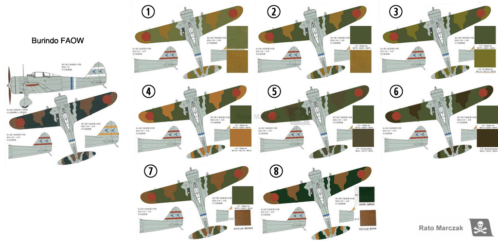
| Scheme | Green | Brown |
| 1 | A1 (Thorpe's scan 1) | A12 (Thorpe's scan 1) |
| 2 | #21 Midoro Iro (Owaki) | A12 (Thorpe's scan 1) |
| 3 | #21 Midoro Iro (Owaki) | #29 K1 Midoro Iro (Owaki) |
| 4 | #21 Midoro Iro (Owaki) | #33 Khaki Iro (Owaki) |
| 5 | #21 Midoro Iro (Owaki) | #31 Cha Kasshoku (Owaki) |
| 6 | #21 Midoro Iro (Owaki) | #24 Ryoku Kasshoku (Owaki) |
| 7 | #21 Midoro Iro (Owaki) | A12 (Thorpe's scan 2) |
| 8 | A1 (Thorpe scan 2) | A12 (Thorpe's scan 2) |
The figure below brings the art from Burindo's FAOW book on the far left. The other shemes follow the table above.
I would love to put my hands in one of those facsimile reproductions of the JAAF paint standards published by Gakken in Japan some years ago. Since I don't have it, I settled somewhere between schemes 2 and 7 above, which means to prepare the A1 green close to Midoro Iro and the brown following Thorpe's A12. Looking at the few color photos that I could find, I guess my choice was in a good ballpark...
For the brown, I mixed Tamiya's XF-59, XF-52, XF-79, and XF-3. I don't know the ratios. I started with an equal mix of the last two and added the others as needed to match A12. My mix for the A1 green started with Tamiya's XF-58 (I found XF-13 too dark for 1/72 scale) and added a bit of XF-3 and GSI H-405 for highlights. Sorry for not taking notes of the exact mix, but I really did this on the fly.
.Before painting the camouflage, I masked and painted the 1st Chutai white stripes on the vertical stabilizer and the fuselage, followed by the fuselage blue stripe indicating that this was the aircraft of the Chutaichō. The drawings in FAOW book were printed in scale and used as a guide to airbrush both colors. Blu-Tack provided raised masks, and a crochet hook is my favorite tool to make the putty to follow the correct contour. I did not waste time with highlights at this point:
Evidently, the colors were too uniform at this stage, and a tad too dark for the scale. It is difficult to work with airbrushed effects with putty masks and avoid paint oversprays where you don't want them... But I was happy that the pattern followed more or less well the drawings which, by its turn, supposedly followed the lost Japanese publication containing the ghost photo of this aircraft... I guess.
Ok, moving on. All ICM decals in kits of this harvest are simply unusable. The brand has been producing some of the best models on the market lately, decals included, but having built a few of their models from that vintage, I would advise you not even to try to use these old ones. Fortunately, the markings on this particular aircraft are relatively easy to mask and paint.
The vertical stabilizer had a stylized 77 on both sides. Having the white stripes already in place, it was just a matter of cutting out the symbols from masking tape and airbrushing them with the same blue used on the fuselage. There are many photos showing the shape of these symbols.
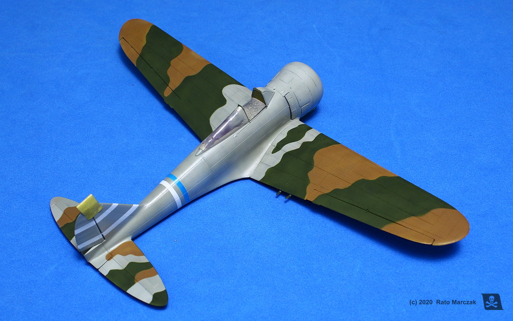
Here is the result. Realistically imperfect:
The 900 mm Hinomarus were all painted, as well as the black anti-slip stripe on the port side of the wing root.
The next steps took many nights and encompassed the superposition of various effects to produce simulate weathering. I will summarize them here but keep in mind that this is my method, and the same effect can be obtained with different methods and different products. More importantly, I don't enjoy using a product/technique without knowing why, neither I am convinced that a modeler should apply a given technique simply because 'it is fun'. So, here are the sequential steps I employed on this model and what I was trying to emulate with each one:
| Main camouflage weathering steps |
| 1. Thinned oil/enamel filters: as I mentioned in the text, I did not use highlights on the
green/brown camouflage. The application of tonal variations to differentiate a few
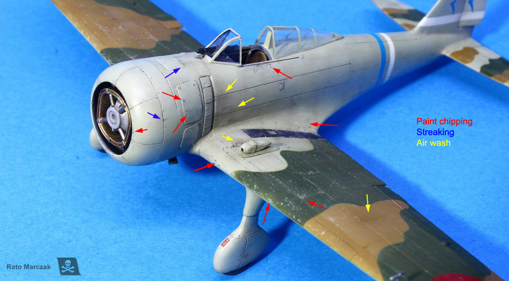
selected panels helped to add more interest and realism. 2. Oil/enamel washes: at this point, the panel lines, rivets, access panels, and fasteners were not evidenced. A dark brown wash made them more distinguishable. Usually, I apply a heavier wash around the engine, wing roots, control surfaces hinges, flaps, behind landing gear, and the underside of the fuselage. In the remaining places, I used a more diluted wash or do not apply any at all. It is also nice to switch to almost black color in some spots like close to the exhaust stacks and cowling fasteners. And since the model was riveted, on the brown/green areas and Hinomarus I used a grey wash to highlight some of the rivets. I had to re-apply the wash on a few places later on, too. 3. Dot filtering: pure (non thinned) oils were used to simulate fading and grime on the brown/green camouflage. Dot filtering also complements liquid filters by accentuating the difference between panels. Grey areas were treated with pure white only, instead of several colors like usually done with this technique. 4. Light paint chipping: because this aircraft was camouflaged in the field, I assumed that the brown/green colors would chip more easily, showing the factory-applied grey through. All the chipping on this model was simulated exclusively using pencils. Light and medium grey were used to replicate the paint chipping and scuffing on the camouflaged areas. On the grey areas, light chipping was simulated using very light grey pencils. 5. Heavy paint chipping: deeper paint chipping can reveal the aluminum underneath or accumulate dirt and grime. Pencils were also used for this, particularly inside the previous light grey chipping around cowling, cockpit, and wing roots. I alternated dark grey and aluminum pencils. 6. Air wash: that's how I call the heavily thinned dark brown mix airbrushed around movable parts, panel lines and alike to simulate false shadow and dirt accumulation. I also use this method to add dirt to the parts of the aircraft which are closer to the ground, like the underside of the tail and, in this particular case, landing gear spats. 7. Streaking: referring to photos, I like to make dark streaks of grime or fluids at specific spots, following the airflow. Usually, I pick a couple of fasteners in the engine area, engine outlets, and hinges of the control surfaces. This is done either with oils or aquarellable pencils. |
And that is pretty much it. I also weathered the Hinomarus, only lightly, as they were generally well cared for, particularly at the beginning of the war. The anti-slip stripe and the exhaust streaks would be treated separately. The photos below show in detail the effects obtained with these simple techniques:
The next photos show the overall effect of the weathering on the model so far.
For the modeler, it can be difficult to have a clear idea of how far the weathering is going during the process. Of course, it is always a nice idea to step back for a few hours and check again your work with a fresh mind, but by then the original painting is already changed, so it is difficult to compare the effectiveness of the whole process.
I like to take a photo before starting the weathering. It helps me to keep track of many things, but also gives me a clear indication of potential problems like color shifting. I know many cases of overweathered models because the modeler lost his/her reference. Even worse, sometimes the repeated application of effects can ruin an otherwise good color choice at the start. In many cases, this explains why we find so many magnificently weathered models with color tones totally irrealistic.
In my case here, the level of weathering I was looking for was achieved and added some realism to an initially too boring camouflage application. I was 85% satisfied with the results.
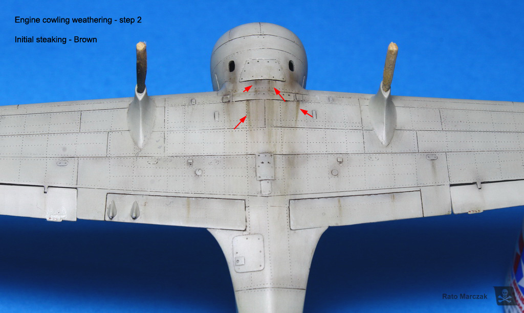
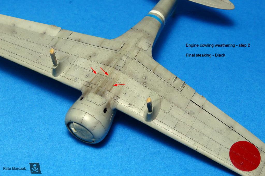
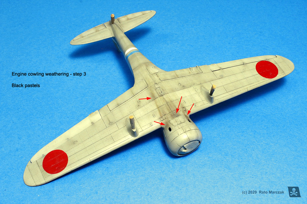
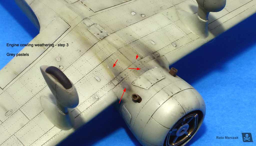
Radials leak, everybody knows it. Add up gravity and you will naturally find the underside of the engine cowling notably grimy. Simulate that without going overboard is one of the steps I enjoy the most in modeling.
My basic sequence for that is the following:
| Engine cowling weathering steps |
| 1. Soot:
this is the very first step, and I generally do it during the air-wash
(post shading panel lines and such). I add more black to the mix and I
airbrush a base of almost-transparent soot. It is like a filter applied
in streaks. It tries to emulate the soot accumulated that is cleaned by
the ground crew after each mission, but with continuous use under
combat conditions the area ends up permanently stained. It is
possible to use transparent colors like Tamiya XF-19 Smoke or Ammo
shaders, but I prefer diluted acrylics because (i) they can be easily
cleaned in case of disaster and (ii) they are flat. 2. Streaking: here I use little dots of pure oils smudged following the airflow to make dark streaks of fluids and grime flowing out of the engine compartment. In the present case, I used dark mud and starship filth from Ammo, and the effect can be repeated at some particular spots. Just don't do it all over the place because an aircraft does not have fluids flowing from every and each panel line/orifice. It is nice to accentuate some streaks using pure black oils or aquarelle pencils afterward or re-applying the streak with a very fine brush or making a new trail inside the previous streaking mark. 3. Diffusing: it does more or less the same that the sooting, except that we use pastels applied with a small brush. The objective is to make the streaking a tad more diffuse and emulate the recent soot. In general, I make large streaks of black pastel powder and then I refine the effect with greys to simulate high-temperature areas and burning residuals deposited. |
As I said, this treatment is applied to the underside of the cowling, only. The photos below show steps 2 and 3:
Another thing that I liked was the final aspect of the rivets. Whenever you do rivets on your models, it is very important to sand them down, or you will end up with rows of tiny lumps that will look like a knight shield from the 13th century. I mean, unless you have raised rivets, but that's another story. This photo was taken purposedly at an angle that shows the rivet lines on the upper port wing. I also retouched the photo to make them more visible. Alive, you really have to get close to the model to see the rivets:
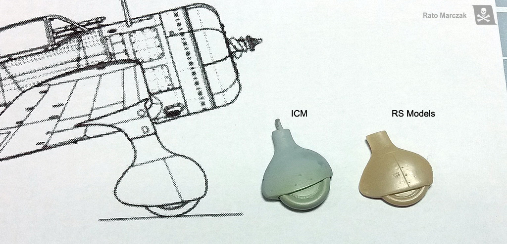
At this point, I decided to glue the landing gear legs. After test fitting the kit assemblies to the model, something did not look right. It took me a while to figure out what. When I checked the landing gear against drawings, it became clear: ICM missed awfully the shape of the spats. Fortunately, I had RS models landing gear from their Ki-79 kit laying around. I trashed the ICM landing gear. The correct shape of key parts makes all the difference. Check it for yourself:
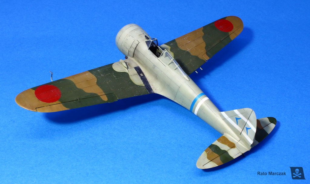
The spats were painted, weathered, and installed. I had to hand paint the small red stencils (no step) in front of each spats since the kit decals were trashed. The anti-slip stripe on the port wing root was weathered with the same treatment that I applied to a similar item on my Revell Hurricane Mk.II C.
For the final clear coat, I played with semi-gloss and flat. Actually, the flat clear was used on a few areas only, like wing roots and underside of the fuselage. Most of the model was coated with a satin finish, and I even let it with the original sheen in some places. These variations in the sheen also add interest to the model and translate correctly what we find in period photos.
Up to this point, I have been postponing the installation of the propeller. And for a reason: the hub details in the ICM part were very soft, and it was almost impossible to clean it up neatly. I made some measurements and decided it would be easy to turn a new hub on my lathe. It went ok. I did not include all de propeller hub details at this point because I made a resin copy of it. Working with the copy, I then drilled the holes to accept the blades and added clamps.
The claw clutch at the center of the hub came from the kit propeller and is devoid of any detail. This part is actually very complicated as it is connected to the drive end of the starter truck. I found a couple of period Japanese magazine covers showing the clutch in detail, but because this model will be in a diorama along with the Hasegawa Toyota starter truck in position, I did not mind much.
If you look around the engine cowling of the Ki-27s, you will note a rule painted on both sides. Those are indexes used to adjust the guns/propeller synchronization. I could have made them as decals, but I discovered it only during the late stages of my build when the model was already painted. They are not visible in all Ki-27s, though.
So I installed the new navigation lights (I sanded them off the wings in the beginning), tail skid, Pitot tube, gunsight, and a gun camera mounted on the wing. The ends of the exhaust stacks (see the beginning of the text) were also glued into their apertures.
And just to prove that this model is mine, I lost the sliding portion of the canopy. I had to thermoform a new one in clear styrene. Oh, boy...
I then would focus on the building of the Toyota GB starter truck and on the diorama base.
These are the books that I used as the main references during this project. I hope you like this article and it inspires you somehow for your next model.
| Technical file | |
| Kit:
|
- ICM 72201 |
| Additions:
|
- Trytools PE seat belts |
| Basic
colors: |
- Primer: automotive lacquer primer. - IJA grey: Tom Colors. - Camouflage reen: mix of Tamiya colors. - Camouflage brown: mix of Tamiya and GSI colors. - Aluminum: GSI Gunze Mr.Color Silver (#008). - Clear coats: Testors Model Master Acryl. |
| Notes: |
- Scratchbuilt propeller - Landing gear spats stolen from the RS kit - Some other scratchbuilt items (see text) |
Rato Marczak © 2020
